The B2B Product Maze That Even Engineers Couldn't Navigate
Who was involved?
- Me (Wolfgang) as Freelance UX/UI Designer
- SCHNEEBERGER internal marketing team
- External developer (agency)
- Several Stakeholders
Timeline
- 2022 - ongoing
- Long-term optimization project
The Problems
- Numerous customer complaints about complex and unclear navigation structure
- Poor findability of products and related information due to inefficient site architecture
- Inconsistent product categorization made orientation and purchase decisions difficult
- Users struggled to locate critical technical specifications and compatibility information
What I actually did
Stakeholder Research
Conducted comprehensive stakeholder surveys to understand KPIs, target groups, and business requirements
Top Task Analysis
Identified and prioritized the most critical product information users need to make informed decisions
Comprehensive UX Audit
Audited individual product hub pages and product detail pages to identify usability issues
Content Architecture
Mapped and analyzed the entire product structure across 86 different products
Problem Analysis
Detailed analysis of pain points across product hub pages and product detail pages
SEO Optimization
Provided comprehensive SEO recommendations to improve product page discoverability
Strategic Recommendations
Presented detailed audit findings with actionable improvement recommendations
Design Implementation
Created wireframes and UI designs based on UX audit findings and user needs
Analytics Review
Analyzed user behavior data to identify patterns and validate design decisions
Important Note
Due to the scale of this project (hundreds of product pages across multiple languages) the full implementation is still in progress. The redesigned pages are currently live in the staging environment, which I cannot publicly share due to confidentiality restrictions. This is why the case study focuses on the research, audit findings, and design process rather than final live metrics.
Key improvements across the product experience
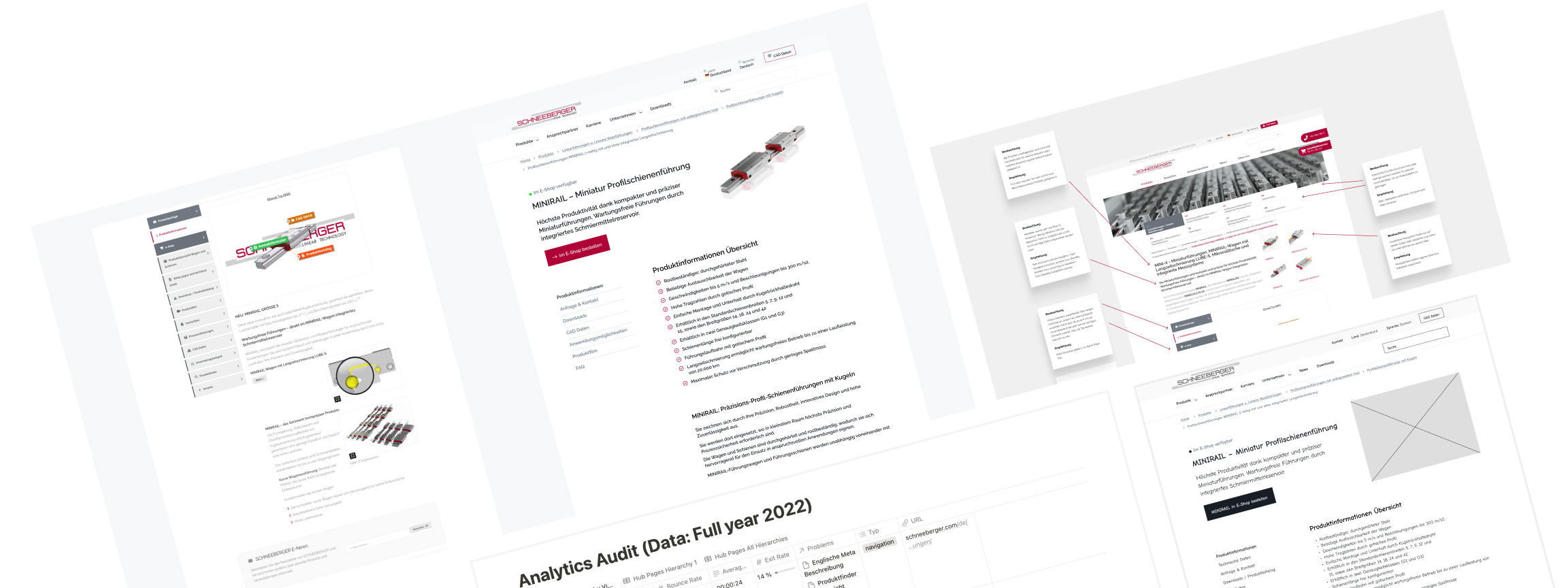
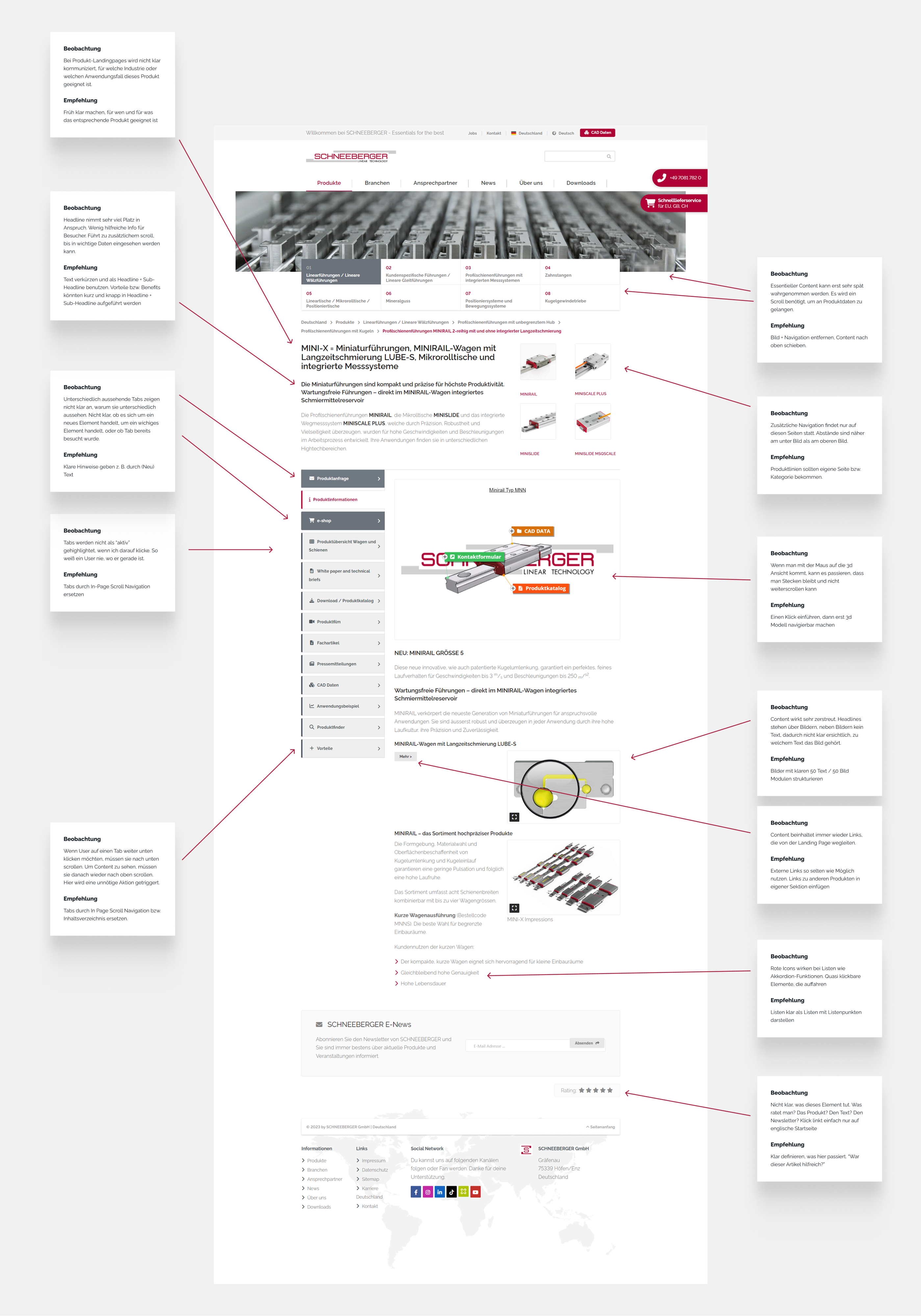
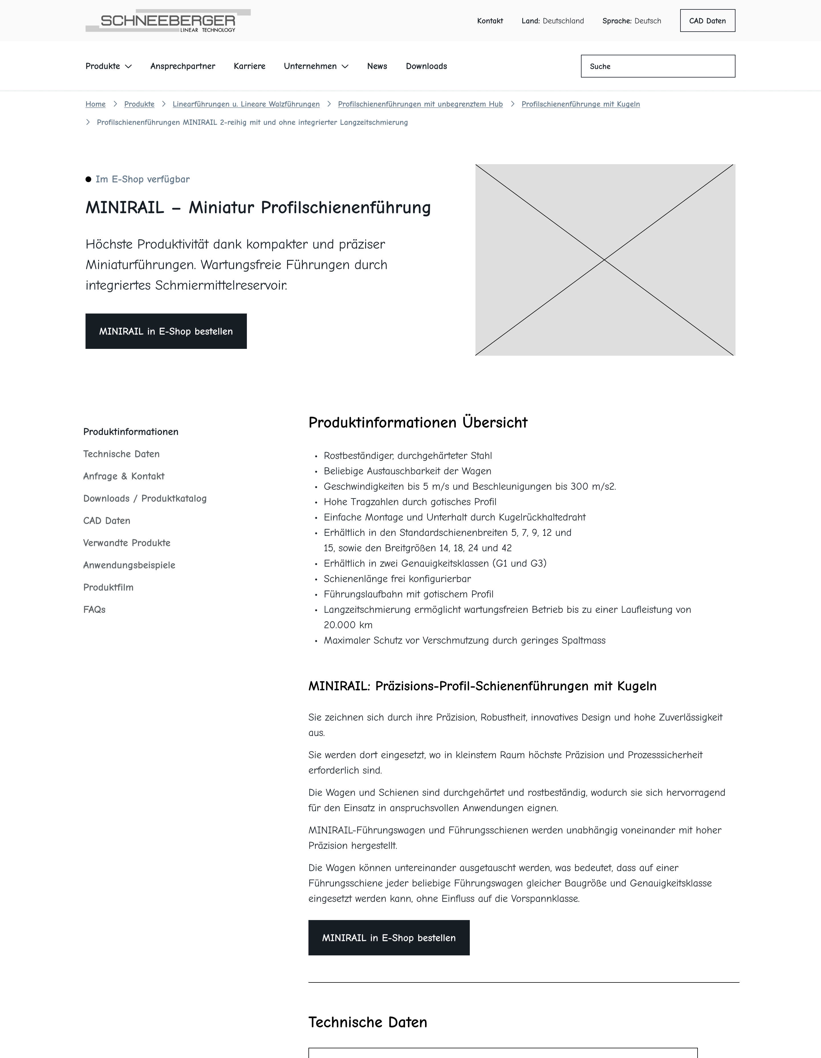
UX Audit
One of 20 product page types / templates I systematically analyzed during the UX audit. This example shows the detailed annotations and usability issues I identified across different sections of the product pages.
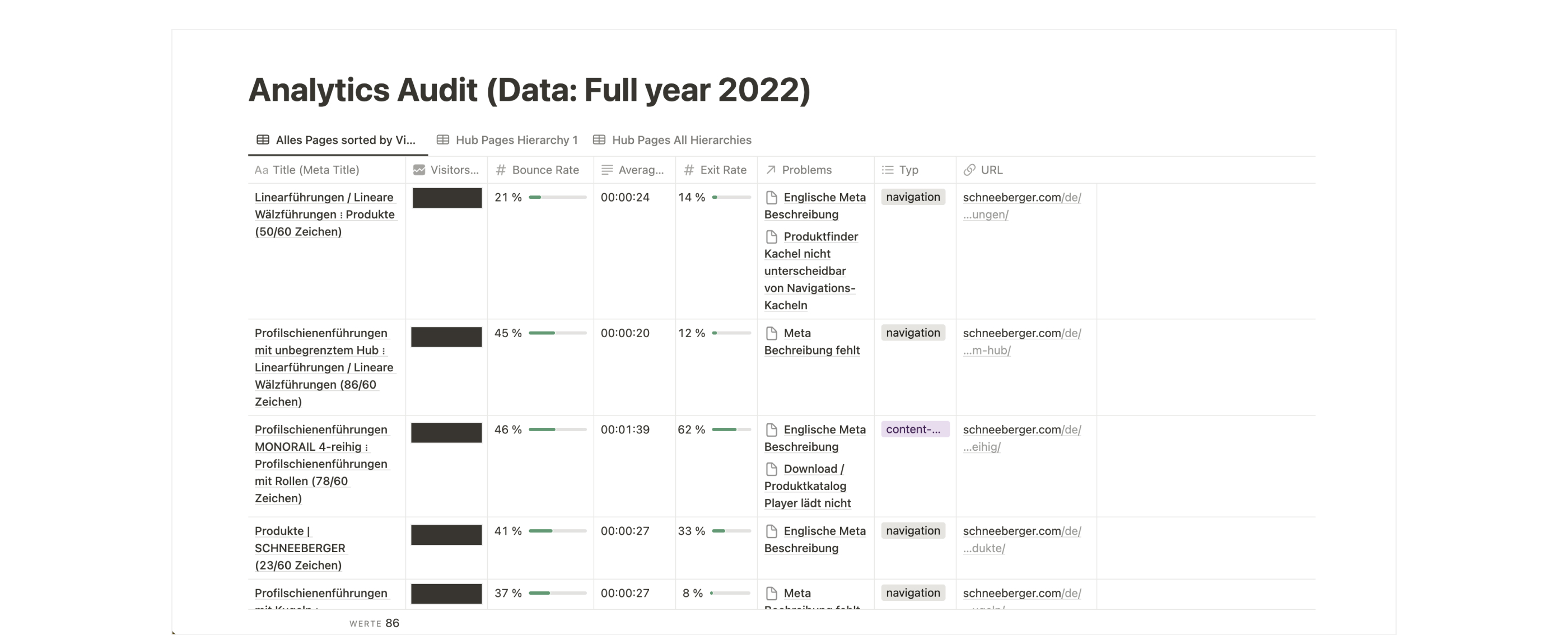
Analytics Report (2022)
Comprehensive analytics audit I conducted to understand user behavior patterns and inform design decisions. This data helped prioritize which product pages needed the most attention and guided the marketing team's focus.
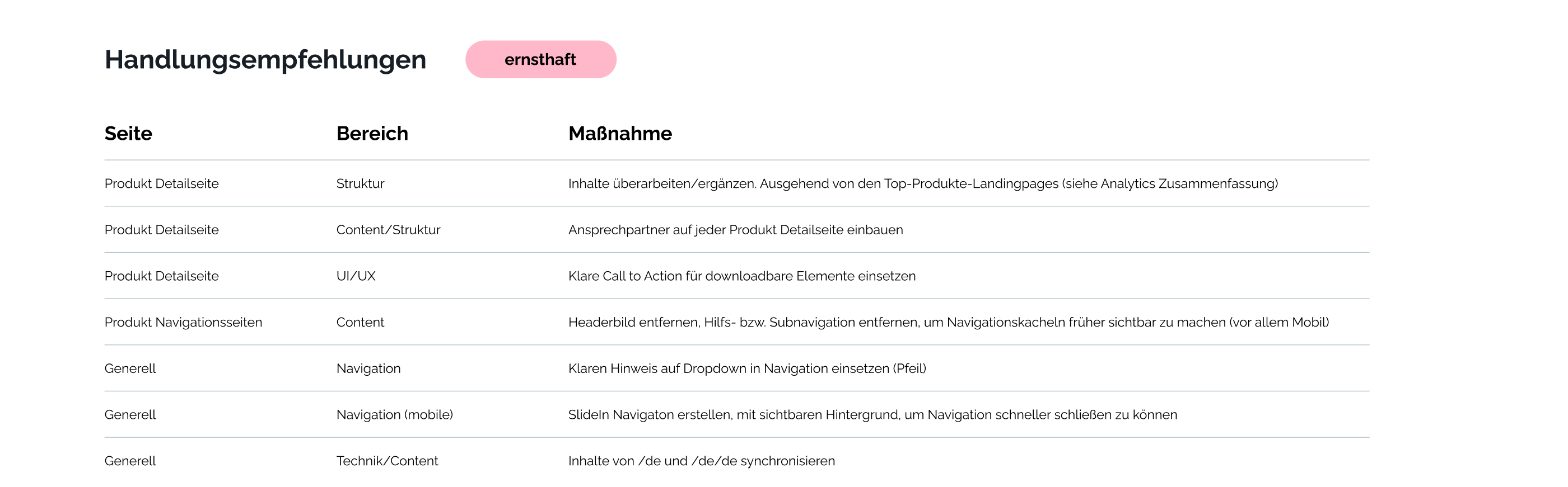
Recommendations after UX Audit and Analytics Audit
Actionable recommendations table highlighting critical issues that needed immediate attention. This prioritized list helped the team focus on the most impactful improvements for the product page experience.
Wireframes
Detailed wireframes addressed the key usability issues identified in the audit phase.
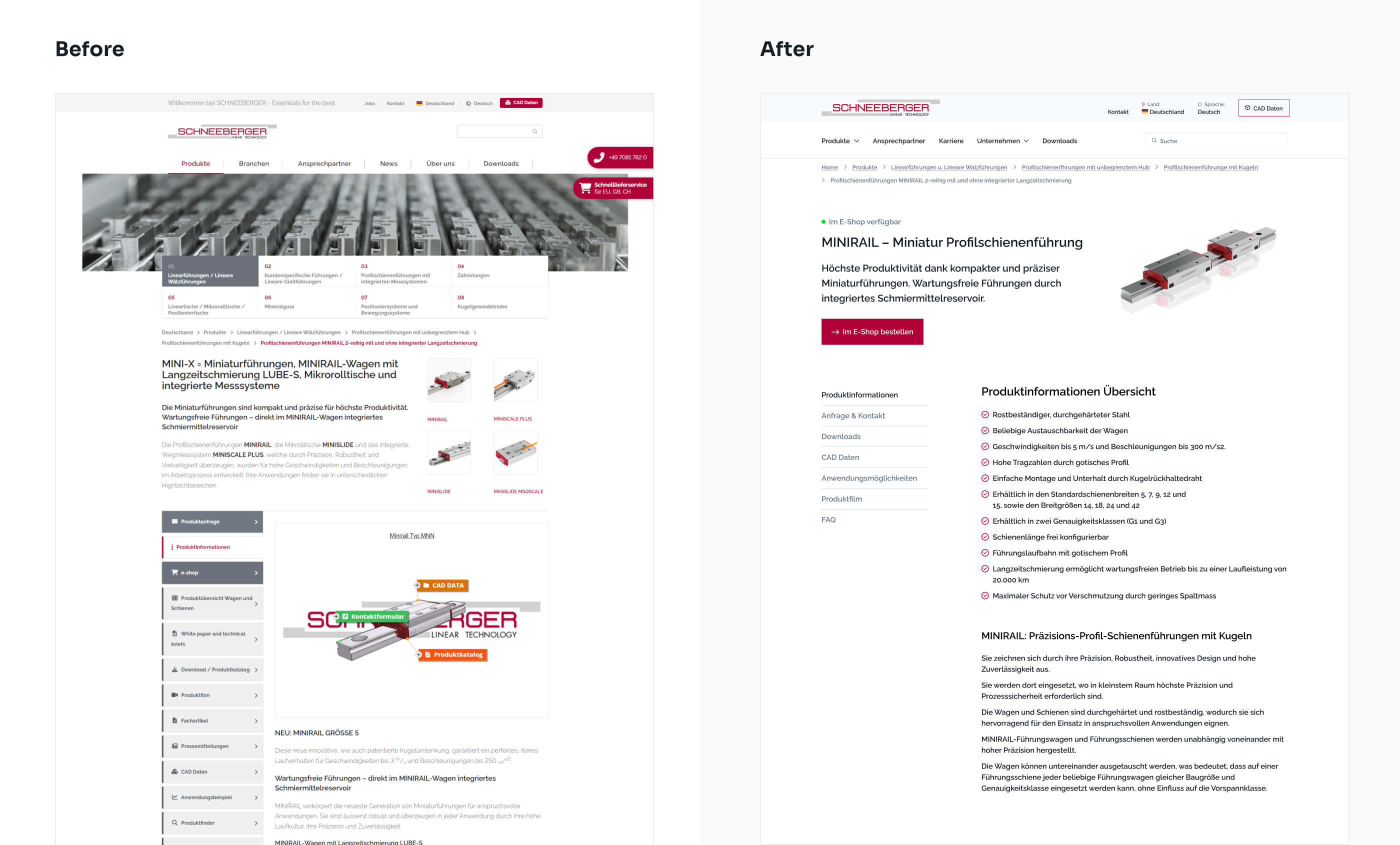
Before & After
Direct comparison of a product page before and after the redesign, showing how we improved information hierarchy, reduced cognitive load, and made technical specifications more accessible.
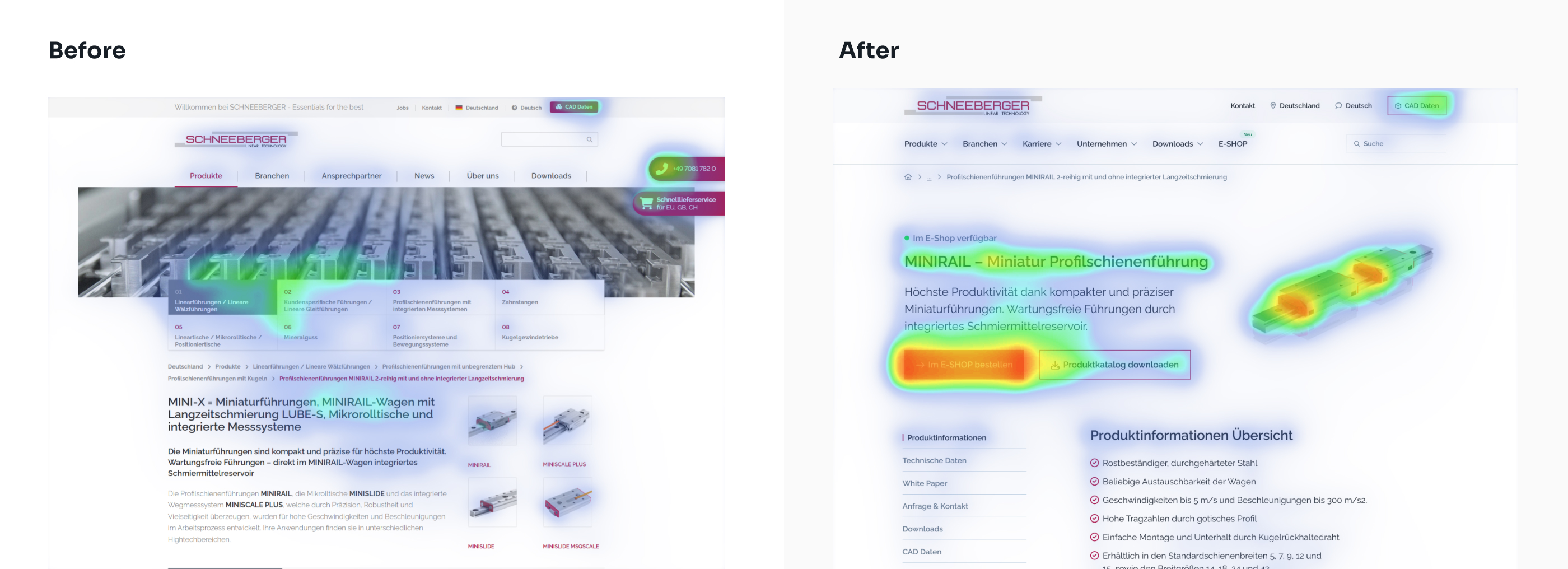
Before & After Heatmaps
Heatmap analysis comparing user attention patterns before and after the redesign. The improved layout shows better focus on critical product information and call-to-action areas.
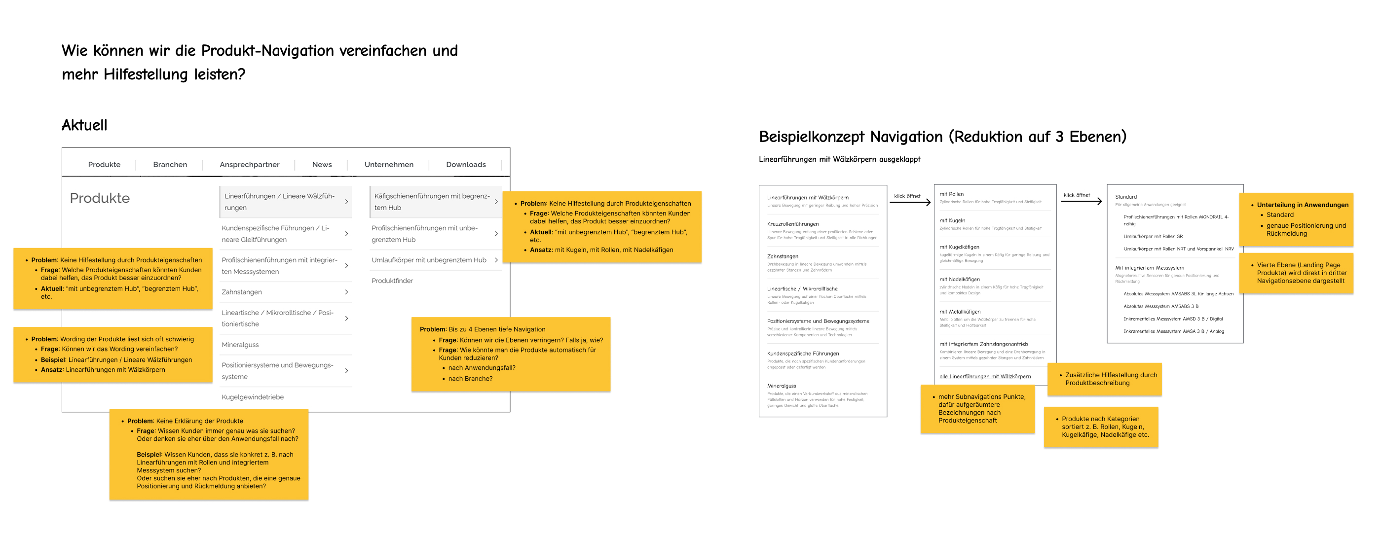
Wireframe concept for improving the navigation
Navigation redesign wireframe with detailed annotations showing how I reduced the navigation depth from 4 to 3 levels, making products faster to find and reducing user frustration with the complex product catalog.
The Process
Research & Discovery
Stakeholder interviews, user needs analysis, and business requirement gathering
Content Audit & Analysis
Comprehensive mapping of 86 products and their information architecture patterns
UX Audit & Problem Identification
Systematic evaluation of product hub pages and detail pages to identify usability issues
Top Task Analysis
Identified critical user tasks and prioritized information hierarchy based on user needs
Solution Design & Wireframing
Created wireframes and UI designs addressing identified pain points and improving user flow
Implementation Support
Provided detailed recommendations and supported the development team with design specifications
The Impact So Far:
Customer Feedback
Marketing & sales teams report happier customers
Clear Action Plan
Comprehensive roadmap for implementation
Ongoing Implementation
Project continues with positive momentum
Heatmap Analysis
Better user attention on critical information
Key Takeaways
- B2B users need efficiency: Technical users prioritize quick access to specifications and compatibility information over marketing content.
- Content architecture is critical: With 86+ products, a clear and consistent information structure becomes essential for usability.
- Stakeholder alignment matters: Understanding business goals and technical constraints early prevented scope creep and ensured realistic solutions.
- Audit-driven design works: Systematic analysis of existing content revealed patterns that informed scalable design solutions.
- SEO and UX can align: Improving content hierarchy and navigation structure benefited both user experience and search visibility.
- Precision engineering demands precision UX: The technical nature of the products required extra attention to accuracy and clarity in information presentation.